

What is Negative Space?
Negative Space (often interchangeably called White Space) is the empty area around, between, and inside the subjects of an image, layout, or UI component. It is not necessarily "white"—it simply refers to any space free of text, images, or interactive elements. It is the breathing room that gives a web design structure and balance.
Why Negative Space Matters in Premium UI Design?
Amateur designers try to fill every pixel with information. Master designers use negative space to control human attention.
- Cognitive Relief: B2B software is inherently complex. Surrounding a highly technical data table with generous negative space reduces cognitive load, making the information feel approachable rather than overwhelming.
- Guiding the Eye: Space directs focus. By isolating a primary "Request Quote" CTA button with ample negative space, you naturally draw the user's eye directly to the conversion point.
- The "Premium" Aesthetic: High-end brands (like Apple or Stripe) use massive amounts of negative space. It subconsciously communicates confidence, sophistication, and luxury. Cluttered pages communicate desperation and cheapness.
- Grouping (Law of Proximity): Adding negative space between different sections visually separates them, helping the user understand that the "Features" section has ended and the "Testimonials" section has begun.
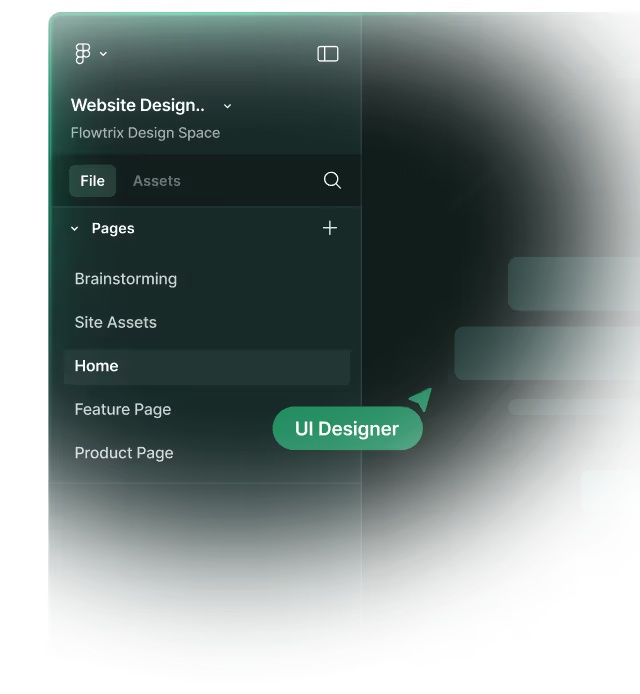
Example from Flowtrix Projects
When translating complex SaaS dashboards from Figma to Webflow, Flowtrix uses a strict, mathematically driven spacing system (like the 8-point grid). We program these negative space variables directly into Webflow's CSS classes. This ensures that every padding and margin decision is deliberate, resulting in an interface that feels open, clean, and effortlessly premium.
Master Webflow.
Get insights directly.


.avif)


.svg)
.svg)

