

Glossary
What is Data Visualization?
Data Visualization is the practice of translating raw, complex data into easily digestible visual elements.
Why Data Visualization Matters in B2B Marketing?
Clear and compelling data visualization is crucial for building trust and communicating product value quickly to B2B decision-makers.
- Credibility: Visually representing results (e.g., '40% increase in conversions') is far more persuasive than text alone.
- Cognitive Ease: Simplifies complex information, allowing users to grasp key benefits immediately, which is crucial for retaining low Bounce Rate.
- UX/UI: It enhances the User Experience (UX) by making the interface more engaging and informative.
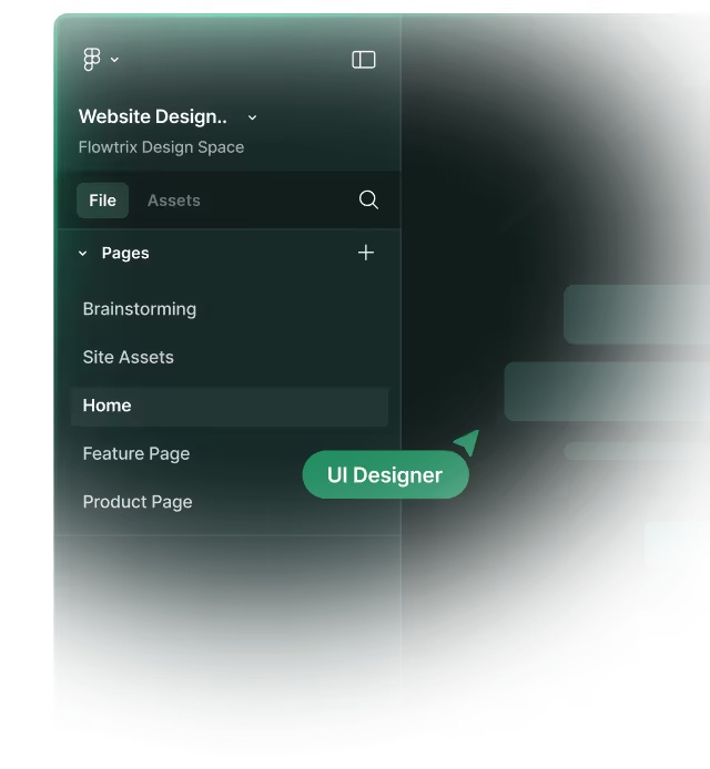
Example from Flowtrix Projects
For B2B and SaaS clients, Flowtrix leverages custom charting and SVG graphics in Webflow to create stunning Data Visualization that highlights key value propositions. Whether it's complex graphs within a user Dashboard or impactful growth metrics on a Landing Page, we ensure the data is presented with perfect Visual Hierarchy to maximize credibility and drive a high Engagement Rate.
Categories:
UI-UX
Analysis
Related Terms:
Master Webflow.
Get insights directly.
Never scheduled, never spammed. Be the first to know when we publish a piece or release something cool!


.avif)


.svg)
.svg)

