


Use AI to summarize this article


Most B2B websites are doing one thing really well. Looking good. Clean layouts, modern fonts, subtle animations. But when you look at the numbers, something is off. Traffic is coming in. Demos are not.
That is the quiet crisis happening inside thousands of B2B SaaS, AI, and cybersecurity companies right now. The website looks fine. It just does not work.
If you are a Head of Marketing, CMO, or founder at a B2B company, you already know this feeling. You have invested in ads, content, and outbound. But the website, the thing every single campaign sends people to, is not converting the way it should.
The good news is that the best-performing B2B teams have figured out what actually moves the needle. And it is not about following visual trends. It is about building a website that functions as a revenue system, not a digital brochure.
This guide breaks down the B2B web design trends that are driving real results in 2026. We are talking about strategies that directly affect demo requests, pipeline, and inbound quality. Not just how your site looks. How it performs.
If you are planning a website revamp or looking to get more out of your current site, this is your starting point.
Why Most B2B Websites Are Quietly Failing
Before we get into the trends, we need to address something most agencies will not tell you. The problem is rarely the design itself. It is the strategy behind it.
Here is what we see again and again. A B2B company spends a significant budget on a redesign. The site launches and it looks great. Leadership is happy. The sales team shares it on LinkedIn. And then, three months later, nothing has changed. The same low demo volume. The same high bounce rate. The same confusion from visitors about what the product actually does.
Why does this happen?
Because the redesign was treated as a visual project. Not a revenue project.
In 2026, the companies pulling ahead are the ones treating their website like their best salesperson. One that works around the clock, speaks to multiple buyer personas, answers objections without being asked, and makes it easy for a visitor to take the next step.
That shift in mindset is what separates a site that looks good from one that drives pipeline.
The average B2B SaaS website converts around 1.4% of visitors into leads. The top performers convert three to five times more. The difference is not traffic. It is design strategy.
Trend 1: Conversion-First Design Is Now the Baseline
The biggest shift in modern web design trends in 2026 is that conversion-first design is no longer advanced. It is the baseline.
What does this mean in practice?
It means every page is designed around a specific goal. Not just "inform the visitor" but "move this type of visitor to this specific action." Homepage visitors see a clear, specific value proposition and one dominant call to action. Product page visitors get context, proof, and a path to demo. Pricing page visitors see objections addressed before they even form.
Agencies that still prioritize visual appeal over conversion architecture are falling behind. The ones winning are treating UX the same way a sales team treats a pitch. Strategic. Intentional. Buyer-first.
Key elements of conversion-first design that are standard in 2026:
Hero sections that do one job: One value proposition. One CTA. No clutter. The best homepages answer three questions in under five seconds. What do you do? Who is it for? Why should I care?
CTA placement driven by scroll behavior: CTAs are not just placed at the top and bottom anymore. They appear at natural decision points. After a case study. After a feature explanation. After social proof. Heatmap data informs every placement.
Friction reduction everywhere: Long forms are gone. Demo request flows are shortened to the minimum viable fields. Every unnecessary step between a visitor and a conversion has been eliminated.
Navigation designed for the buyer journey: Menus are structured around how buyers think, not how the company is organized internally. This is a subtle but powerful shift.
Trend 2: Persona-Specific Pages and Messaging by Segment
One homepage cannot speak equally well to a CISO, a VP of Marketing, and a Founder. Yet most B2B websites try to do exactly that. The result is messaging that feels vague and pages that convert no one well.
The current web design trends show a clear move toward segmented experiences. High-performing B2B teams are building persona-specific solution pages, industry pages, and use-case pages that speak directly to one type of buyer.
This approach works because it removes cognitive load. When a Head of Marketing from a cybersecurity company lands on a page written specifically for marketing leaders in security, they immediately feel understood. That feeling of relevance builds trust faster than any design element.
What this looks like in 2026:
Solution pages by role. Pages built for CMOs, CTOs, Heads of Demand Gen, and Founders, each emphasizing different benefits of the same product.
Industry pages that speak the language. A page for fintech companies uses fintech language. A page for AI startups addresses AI-specific challenges. Not generic copy pasted across verticals.
Dynamic hero sections. Some teams are now adjusting hero messaging based on the traffic source. Visitors coming from a LinkedIn campaign targeted at CTOs see CTO-relevant copy. Visitors from a Google ad campaign see different messaging.
You do not need to build dozens of pages to start. Even four to six well-crafted persona pages can have a significant impact on conversion rates for the right traffic.
Trend 3: Bento Grid Layouts for Complex Product Storytelling
One of the most visible web page design trends in 2026 is the rise of bento grid layouts on product and feature pages. If you have visited any top SaaS website in the last six months, you have seen this.
Bento grids are modular, card-based layouts that present multiple features or benefits in a visually organized grid. Think of it as a magazine-style layout applied to a web page.
Why are they effective for B2B?
B2B buyers scan before they read. They are busy. They are evaluating multiple vendors. They want to see if your product checks their boxes quickly, before committing time to reading. Bento grids make that scanning experience natural and efficient.
Each card in the grid can address a specific buyer question. Security? There is a card for that. Integration with their existing stack? There is a card for that. Speed to value? There is a card for that.
When combined with proper visual hierarchy, clear copy, and supporting icons or screenshots, bento grids turn complex product stories into digestible, scannable experiences.
Where bento grids work best:
- Feature pages showing multiple capabilities
- "Why us" sections comparing approaches
- Homepage benefit sections after the hero
- Integration showcases
The key is that each block must serve a purpose. Bento grids used as decoration, with vague copy and filler icons, do not help. Every block should answer a real buyer question.
Trend 4: Speed and Core Web Vitals as Revenue Levers
Page speed is not just a technical metric. It is a revenue metric.
Research consistently shows that a one-second delay in page load time can reduce conversions by up to 7%. For a B2B site generating a hundred demo requests per month, that is seven demos lost. Every single month. From one second of friction.
For B2B SaaS companies specifically, this matters even more. Your buyers are experienced, sophisticated professionals. They use fast, modern tools every day. A slow website signals that your company does not care about the details. And in a high-trust, high-ticket sale, that signal matters.
Core Web Vitals are the specific performance metrics that Google uses to measure page experience. There are three main ones to understand:
Largest Contentful Paint (LCP): How fast the main content on your page loads. Target is under 2.5 seconds.
Cumulative Layout Shift (CLS): Whether your page jumps around as it loads, which frustrates users. Target is under 0.1.
Interaction to Next Paint (INP): How quickly your page responds when a user clicks or taps something. Target is under 200 milliseconds.
Poor scores on any of these hurt both SEO rankings and user experience at the same time. The fix requires clean code, optimized images, a fast hosting infrastructure, and a platform that is built for performance.
This is one reason why Webflow migration is so common among B2B SaaS teams right now. Webflow's hosting infrastructure and clean code output consistently produce strong Core Web Vitals scores compared to plugin-heavy WordPress sites.
Trend 5: Strategic Social Proof, Not Decorative Social Proof
Every B2B website has logos. Every B2B website has testimonials. Most of them are not doing the job they are supposed to do.
Here is the problem. A wall of logos at the bottom of the homepage is not social proof. It is decoration. A testimonial buried in a carousel that auto-rotates is not proof. It is noise.
In 2026, the most effective B2B websites are using social proof contextually. Meaning, the right proof appears at the exact moment a buyer needs it.
A visitor reads about your enterprise security features. Directly below, they see a quote from a CISO at a Fortune 500 company. That is contextual social proof. It addresses a specific concern, in the right place, from a credible source.
How top B2B sites structure social proof in 2026:
Proof near every major CTA: Before a visitor clicks "Book a Demo," they see a short, specific testimonial about what happened after someone else booked a demo.
Metrics that tell a story: Not just "50% increase in conversions" in isolation. But "Databahn saw a 50% increase in demo requests within 60 days of launching their Webflow revamp." Context makes data believable.
Case study previews mid-page: Not just a "Resources" link in the nav. Actual case study cards placed within relevant product or solution pages.
G2 and Capterra ratings near pricing: At the exact moment of highest hesitation, a buyer sees that 200 other companies rated you 4.8 out of 5.
Trend 6: Structured Data and Technical SEO Built Into Design
One of the most overlooked modern web design trends is treating SEO as a design decision, not an afterthought.
The typical pattern is: build the site, launch it, then add meta descriptions and fix SEO issues. This approach wastes months of potential ranking time and often results in structural problems that are expensive to fix later.
In 2026, the companies getting the most organic traffic from their websites are the ones that built SEO foundations into the design and development process from day one.
This means:
URL structure that matches information architecture: Your URLs should reflect how buyers think about your product, not how your CMS generates slugs by default.
Heading hierarchy that helps search engines understand page structure: H1 for the main topic. H2s for major sections. H3s for subtopics. This is basic, but a huge percentage of B2B sites get it wrong.
Schema markup for rich results: Structured data tells Google exactly what your content is about. For B2B SaaS companies, the right schema can mean FAQ snippets, product information, and ratings appearing directly on the search results page. This increases click-through rates even without ranking higher.
Image optimization and alt text: Every image should be compressed, served in modern formats like WebP, and tagged with descriptive alt text that includes relevant keywords.
The Flowtrix Schema App was built specifically for Webflow users who want to add structured data without writing code. B2B SaaS companies implementing schema typically see a 15 to 30% improvement in click-through rates within the first month.
Trend 7: Webflow as the Preferred Platform for B2B Marketing Teams
There is a reason why more B2B marketing teams are choosing Webflow in 2026. It is not because it is the trendiest platform. It is because it solves real problems that WordPress, HubSpot CMS, and other legacy platforms consistently fail to solve.
The core problem with most traditional CMS platforms is developer dependency. Every time a marketing team needs to launch a new landing page, update a section, or run a campaign, they have to go through a developer. That creates a queue. The queue creates delays. The delays kill campaign momentum.
Webflow fixes this at the structural level. Marketing teams can build new pages, update CMS content, adjust layouts, and launch experiments without touching a line of code. The design quality stays consistent because Webflow's component and class system enforces consistency across the site.
For enterprise-level B2B companies, Webflow Enterprise adds features like SSO, advanced user permissions, dedicated support, and SLA guarantees. This makes it viable for large teams with multiple contributors, strict security requirements, and complex content operations.
From a performance standpoint, Webflow sites are hosted on AWS with a global CDN. Pages load fast. SEO foundations are strong. And marketing teams are not at the mercy of a slow shared hosting environment.
Why B2B SaaS teams are making the switch in 2026:
- Marketing autonomy without developer dependency
- Clean code that produces strong Core Web Vitals scores
- Built-in SEO controls without plugin management
- Component-based CMS that scales with the business
- Enterprise-grade security and compliance for larger teams
If you are still running on WordPress and frustrated with the pace at which your team can move, the SaaS Webflow migration guide is worth reading before you plan your next revamp.
Trend 8: Continuous Optimization Instead of One-Time Launches
Here is the mindset shift that separates the top-performing B2B websites from everyone else.
They do not treat a website launch as a finish line.
The old model was: spend big on a redesign every three years. Launch. Hope for results. The new model is: launch a solid foundation, then keep improving it based on real data.
What does continuous optimization look like in practice?
Monthly CTA testing: Testing different button copy, placement, and color based on heatmap and conversion data.
Messaging updates based on sales feedback: The sales team hears objections every day. Those objections should inform homepage and product page copy on a regular basis.
New solution pages as the product evolves: When you launch a new use case or target a new vertical, a new page should go live within days. Not weeks.
Performance reviews on a monthly basis: Looking at which pages are generating the most demo requests and which ones have high exit rates. Then making targeted improvements.
This continuous optimization model requires two things. First, a website platform that makes changes fast and safe. Webflow is built for this. Second, a design and development partner who can move at the speed your marketing team needs.
This is why Flowtrix offers ongoing Webflow retainers alongside full revamp projects. Not because it creates dependency, but because the companies getting the best results from their websites are the ones treating it as a living system.
Trend 9: AI-Assisted Design That Speeds Up Without Sacrificing Strategy
AI is entering the B2B web design process in ways that are genuinely useful, but also easy to misuse.
The useful applications are around speed and iteration. AI tools in Figma are helping designers generate layout options faster. AI copy tools are helping teams draft multiple versions of hero headlines for A/B testing. AI analytics tools are helping teams spot performance patterns in heatmaps and session recordings more quickly.
What AI cannot replace is strategy. Understanding which message to lead with for a specific audience. Knowing which trust signals matter most to a cybersecurity buyer versus a data infrastructure buyer. Deciding how to structure a pricing page for a product with complex enterprise pricing.
Those decisions require human judgment, B2B market knowledge, and experience building sites that have actually worked.
The best B2B web design teams in 2026 are using AI as a tool to go faster, not as a replacement for the strategic thinking that makes websites convert.
Trend 10: Accessibility as a Design Standard
Accessibility has moved from a checkbox exercise to a genuine design standard. And for B2B companies, this shift has both ethical and commercial implications.
From the commercial side, accessible websites rank better in search engines. Google uses many of the same signals that determine accessibility, such as proper heading structure, descriptive link text, and image alt tags, as SEO ranking factors.
From the compliance side, WCAG 2.2 guidelines are increasingly being referenced in enterprise procurement processes. If your product is being evaluated by a large enterprise, they may specifically check whether your website meets accessibility standards.
Practically, accessible B2B website design in 2026 means:
Proper color contrast. Text must be readable against its background at a ratio of at least 4.5 to 1.
Keyboard navigability. Every interactive element on your site should be reachable and usable without a mouse.
Descriptive alt text on all images. Not just "image.jpg" but a description of what the image shows and why it is relevant.
Logical focus order. When someone tabs through your page, the focus should move in a logical sequence that matches the visual layout.
Most of these improvements also make websites cleaner, faster, and easier to use for everyone. Accessibility is not a tradeoff against great design. It is part of what great design means in 2026.
What This Means for Your 2026 Website Strategy
These ten trends point in one direction. B2B websites that drive revenue in 2026 are fast, focused, persona-aware, and built on platforms that give marketing teams real control.
They use social proof strategically. They are optimized for search from day one. They treat accessibility as a standard. And they are continuously improved based on data, not redesigned every three years based on gut feeling.
If your current website checks most of these boxes, you are ahead of the curve. If it does not, the gap between your site and the top performers is growing every month.
The question is not whether these things matter. They clearly do. The question is whether your current website and your current agency partner are actually set up to execute on them.
How Flowtrix Approaches B2B Web Design in 2026
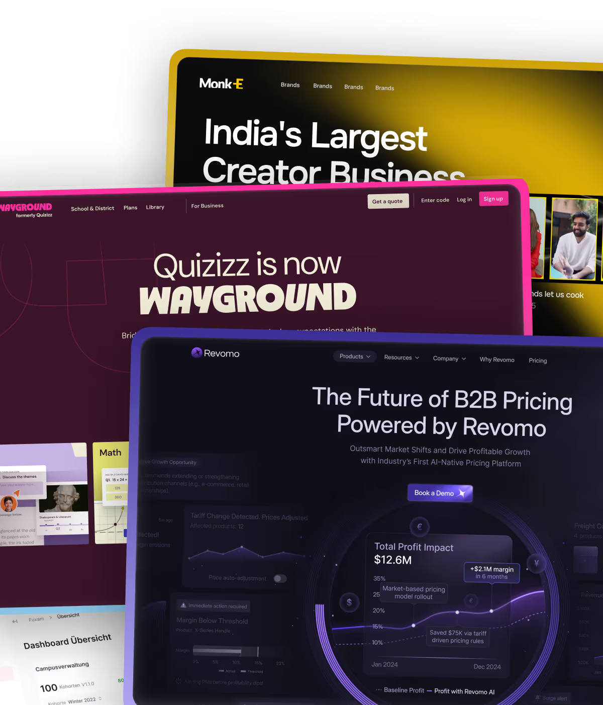
Flowtrix is a certified Webflow Enterprise Partner specializing in website revamps for B2B SaaS, AI, and cybersecurity companies. We have delivered 120+ projects globally, working with companies like Databahn, Akirolabs, Fuxam, and Wayground. We were nominated as Webflow Partner of the Year 2025.
We do not build websites that look good. We build websites that drive pipeline. Every revamp we do combines strategy, CRO-focused design, Webflow development, and technical SEO into one integrated service.
Our clients are typically Heads of Marketing, CMOs, and founders at Series A to Series C B2B companies who need their website to function as a predictable inbound and demo booking engine.
If your website is not performing the way it should, let us take a look at it together. We will tell you exactly what is holding it back.


.avif)


.svg)
.svg)

