


Use AI to summarize this article


Most B2B landing pages look great but fail at the one thing they are supposed to do. Convert visitors into demo calls, signups, or qualified leads.
The problem is not bad design. It is design without strategy. A page can have clean visuals, smooth animations, and a modern layout. But if it does not guide a busy VP of Marketing toward a clear next step, it is just an expensive digital brochure.
If you are looking to build or revamp your B2B website design, you need landing pages that combine visual quality with conversion thinking. This guide breaks down 12 real B2B landing page design examples that are getting results in 2026. Most of these are projects we built at Flowtrix for our clients. We explain exactly what we did, why it works, and what you can take from each one.
What Makes a B2B Landing Page Different From B2C
B2B buyers are not making impulse purchases. They are researching solutions, comparing vendors, and building a case for internal stakeholders. On average, B2B purchasing decisions involve 4 to 6 people. That changes everything about how your landing page should work.
A good B2B landing page needs to do three things at once. First, it must speak to the specific pain point that brought the visitor there. Second, it must build enough trust to justify the next step. Third, it must make that next step incredibly easy.
The best B2B website designs in 2026 focus on outcomes, not features. They show what changes after someone uses the product, not just what the product does. They also load fast and look great on mobile, because most B2B research happens on phones during commutes and between meetings.
This shift toward conversion-focused design is why more companies are moving away from generic website design agencies and choosing specialized partners like Flowtrix.
What Is B2B Landing Page Design?
A B2B landing page is a standalone page built to convert one specific type of visitor into one specific action, usually a demo request, a free trial signup, or a contact form fill. Unlike a homepage, which has to serve every visitor and every use case at once, a landing page exists for one traffic source and one message.
The best B2B landing pages share three things. They match the intent of the ad, email, or search query that brought the visitor there. They remove every distraction that isn't the CTA, including navigation menus in most cases. And they prove the claim in the headline within the first scroll, using real client results, not vague promises.
At Flowtrix, we treat landing pages as the highest-leverage page type on a B2B website. A homepage might get more traffic, but a landing page built for a specific campaign converts at a far higher rate because it's speaking to exactly one person about exactly one problem.
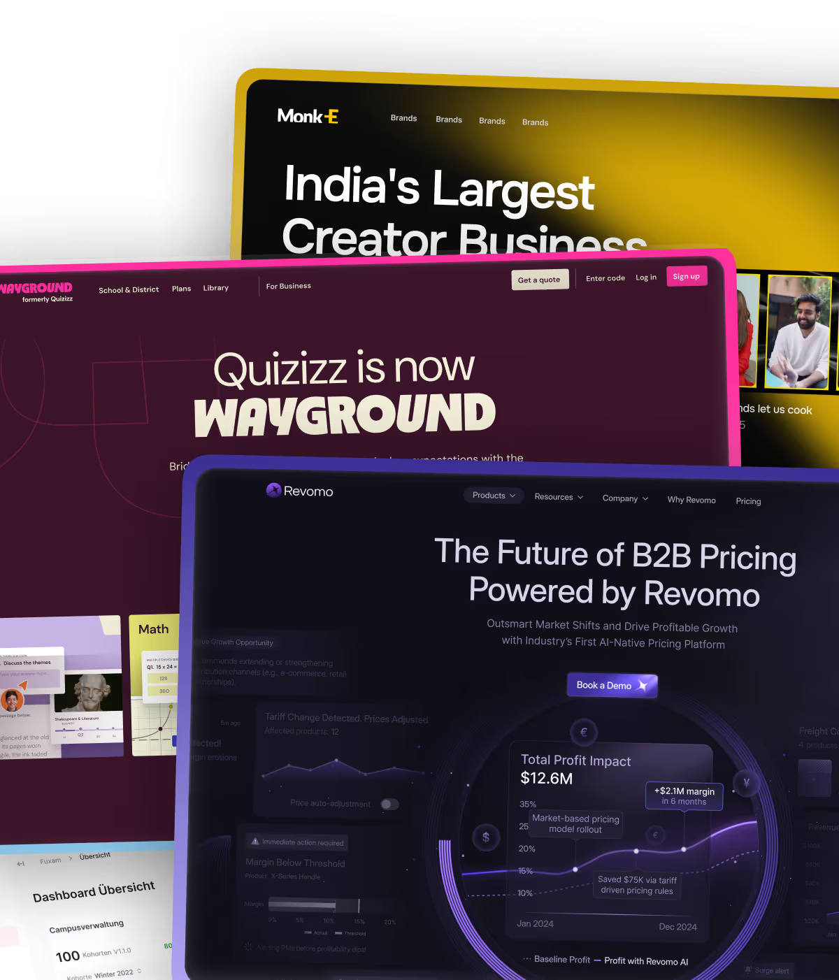
1. Wayground

Wayground is an AI-powered education platform that raised $71M in total funding. When they went through a complete rebrand, they needed a partner who could handle the Webflow Enterprise migration without breaking anything.
Flowtrix managed the full enterprise website migration seamlessly. The landing page now reflects their updated brand identity with clean visuals, fast load times, and a clear product narrative. The site feels modern and enterprise-grade while still being easy for their marketing team to manage and update.
Connor Pierson from Wayground said: "Flowtrix made our rebrand seamless with a smooth and faster site."
Takeaway: When migrating to Webflow Enterprise, work with a partner who understands both the technical migration and the conversion strategy. A rebrand is an opportunity to improve conversions, not just update the look.
2. Pepsales
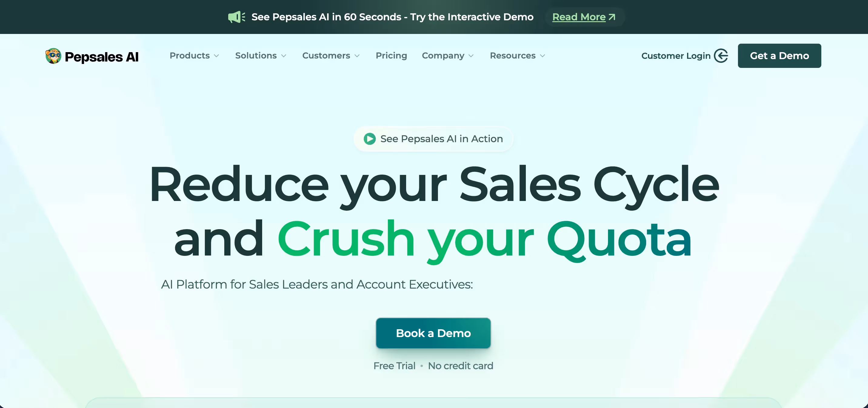
Pepsales is an AI-powered sales automation platform that raised $1.1M in seed funding. They needed a full website and brand revamp because their existing site did not match the quality of their product.
Flowtrix handled the end-to-end project, from brand identity to landing page design to Webflow development. We focused the hero section on a single, clear value proposition. Below the fold, we structured product benefits around the specific pain points their ICP faces: slow sales cycles, low demo conversion rates, and lack of pipeline visibility.
After the revamp, Pepsales saw a significant boost in conversions. Co-founder Ajay Singh shared: "They made everything smooth, took ownership, and delivered exactly what we needed. After the revamp, our conversions went up significantly."
Takeaway: A brand revamp is not just visual. Align your landing page messaging with your buyer's actual pain points. That is what drives conversion lifts.
Read the full Pepsales case study
3. AuditCue
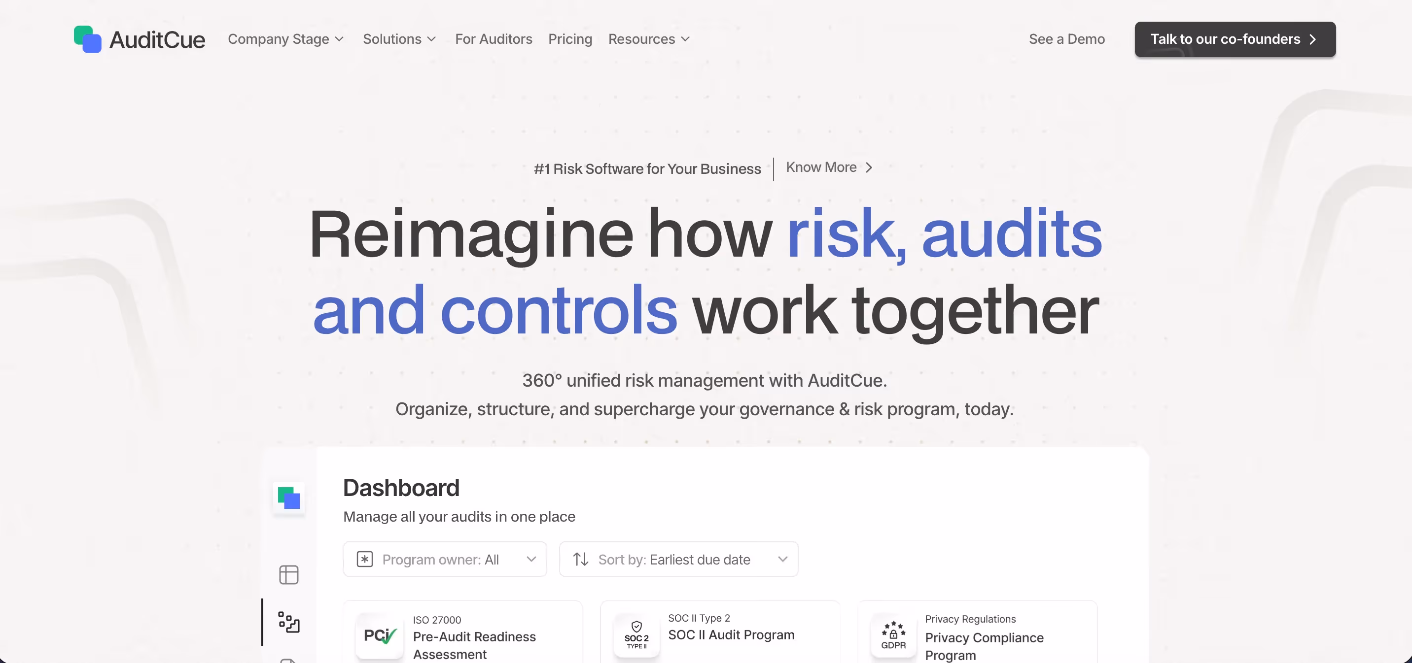
AuditCue builds an AI-powered audit and risk management platform for enterprise compliance teams. Their challenge was common among B2B SaaS companies: the website looked outdated and did not generate enough inbound pipeline.
Flowtrix revamped the website in Webflow with a focus on conversion. We simplified the navigation, tightened the messaging, and placed trust signals like client logos and security certifications above the fold. The landing page now clearly communicates who AuditCue is for, what it does, and why a compliance team should care.
Co-founder Gaurav Kulkarni said: "After the revamp, our inbound leads and website conversions doubled."
Takeaway: For enterprise buyers, trust signals matter more than flashy design. Place certifications, logos, and compliance information where decision-makers will see them first.
Read the full AuditCue case study
4. CogniSwitch

CogniSwitch is an AI deep-tech platform that doubled its enterprise conversions after working with Flowtrix. The biggest challenge was translating highly technical AI capabilities into language and visuals that a Head of Marketing or business buyer could understand.
We created a landing page that uses clean visuals and motion graphics to explain complex concepts without overwhelming the visitor. The layout follows a clear progression: what the product does, how it works, who uses it, and what results they get. Every section builds on the last.
Nikhil John, Head of Marketing, noted: "Flowtrix transformed our AI deep-tech website with a sleek, modern design and seamless user experience. Their expertise made a huge impact, elevating our brand and engagement significantly."
Takeaway: Deep-tech does not have to look complicated. Use motion graphics and progressive disclosure to make complex products feel simple and approachable.
Read the full CogniSwitch case study
5. SARAL

SARAL is an influencer marketing platform for ecommerce brands. Their Webflow website, built by Flowtrix, needed to speak to a very specific audience: DTC brand founders and marketing managers looking to scale influencer partnerships.
We designed the landing page with a strong hero section that leads with the core benefit. Below the fold, we structured the content around SARAL's key workflows: finding influencers, managing outreach, and tracking results. Each section has its own CTA, giving visitors multiple opportunities to convert based on where they are in their research.
Founder Yash Chavan said: "If you're looking for a Webflow agency, don't look beyond Flowtrix." The website saw 30% growth in conversions after the revamp.
Takeaway: Structure your landing page around your product's key workflows. Let each section serve as a mini-conversion point.
Read the full SARAL case study
6. HyperVerge

HyperVerge is an AI-powered identity verification platform. For a product that deals with sensitive data like identity documents and facial recognition, trust is everything on the landing page.
Flowtrix focused the revamp on credibility and clarity. We placed security badges, compliance certifications, and client logos prominently above the fold. The product explanation uses screenshots and visual workflows instead of long text blocks. The demo CTA is clear and repeated at multiple scroll points.
Growth Marketer Sairanjan Dasgupta shared: "Flowtrix team has been great to work with. Their ownership and attention to detail helped us push our website to its potential." The result was 60% higher lead generation.
Takeaway: For security and compliance products, lead with trust signals. Certifications, audit badges, and recognizable client logos should sit above the fold, right next to your CTA.
Read the full HyperVerge case study
Best B2B Landing Page Layouts for AI Agencies in 2026
AI companies face a specific landing page problem: the product is often hard to picture. Here are four layout patterns that work well when you're selling something abstract.
Hero + Live Demo
The headline states the outcome in one line. Below it, an embedded product demo or interactive walkthrough runs automatically, so visitors see the product working before they read a single feature bullet. This layout works because AI buyers trust what they can see functioning more than what they read described.
Feature Grid
A bento-style grid breaks the product into 4 to 6 discrete capabilities, each with a short label and one-line explanation. This works for AI products with multiple use cases, since it lets different buyer types find the capability relevant to them without scrolling through irrelevant sections.
Social Proof Wall
Client logos, then immediately below them, 3 to 4 short outcome statements with real numbers attached. For AI products, buyers are often wary of overclaiming, so leading with verified client results before any product explanation builds trust faster than leading with features.
Interactive Demo
A fully embedded, clickable version of the actual product interface, not a screenshot or video. Visitors can click through a real (often sandboxed) workflow themselves. This is the highest-converting layout for technical buyers evaluating AI tools, because it removes the "what does this actually look like" question entirely.
7. Actalyst

Actalyst came to Flowtrix needing more than just a website revamp. Their product was hard to explain with static images. We solved this by creating custom motion videos and graphics that show exactly how the platform works.
The landing page uses these motion elements as the primary storytelling tool. Instead of paragraphs of text explaining features, visitors watch short animations that demonstrate the product in action. This approach cut down the time it takes for a visitor to understand the value proposition.
Founder Purnesh Gali said: "Flowtrix handled our website revamp seamlessly. They also explained our product with beautiful motion videos and graphics. The results? A smoother experience and a significant boost in conversions!" The website saw 2x conversions after the revamp.
Takeaway: If static screenshots do not do your product justice, invest in motion graphics. Short product animations can communicate more value in 10 seconds than a full page of text.
Read the full Actalyst case study
8. Akirolabs

Akirolabs is a Berlin-based enterprise SaaS company that builds an AI-powered procurement platform. Translating this complex offering into a clear, conversion-focused website was the core challenge.
Flowtrix redesigned and built the website to reflect the updated brand identity. We created a flexible CMS structure for future growth and turned technical product details into a user-friendly page flow. The landing page guides enterprise buyers through the platform's capabilities without overwhelming them.
The result is a website that communicates enterprise readiness while still driving demo bookings.
Takeaway: Enterprise websites do not need to be boring or text-heavy. A clean layout with clear information architecture can communicate complexity and credibility at the same time.
Read the full Akirolabs case study
9. Zuddl
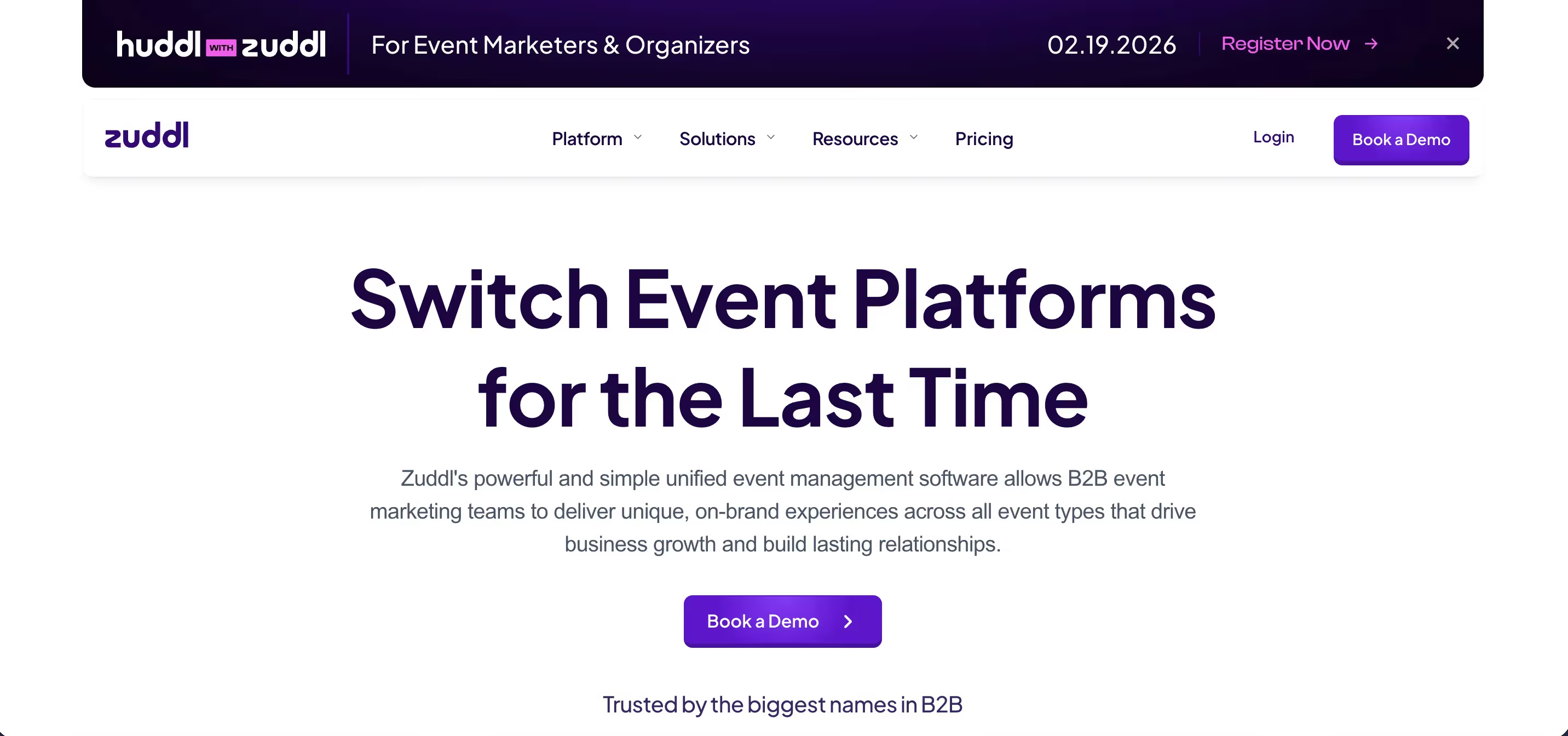
Zuddl is a unified event management platform that raised $15.5M in funding. Their design team had pixel-perfect Figma files that needed to be translated into Webflow without compromise.
Flowtrix delivered a Webflow build that matched the design file exactly. The landing page features clean product visuals, strong social proof from enterprise clients, and fast load times. Every page was optimized for speed and mobile responsiveness.
Product Designer Ansh Mehra said: "Every time I want anything developed in Webflow really fast, I go to Flowtrix. Their speed and accuracy is absolutely on point. Pixel to pixel translation from Figma."
Takeaway: Your landing page design is only as good as its development. A pixel-perfect Webflow build ensures your conversion-optimized design actually works in the browser.
Read the full Zuddl case study
10. Databahn

Databahn is an AI-powered data pipeline management platform that raised $17M in Series A funding. When they came to Flowtrix, their website did not reflect the strength of their product. The messaging was complex. The page structure made it hard for buyers to understand the platform's value quickly.
Our team restructured the entire landing page around a clear narrative flow. We broke down Databahn's data fabric features into visual workflow sections that walk visitors through the platform step by step. CTAs sit at natural decision points where a visitor is most likely to take action, not just at the top and bottom.
The result was a significant uptick in inbound leads after the revamp. Their Head of Marketing, Vipul Nanda, said: "We have seen a significant uptick on inbound leads after the website revamp."
Takeaway: For complex enterprise products, structure your landing page as a guided walkthrough. Break technical features into visual steps that a non-technical buyer can understand.
Read the full Databahn case study
11. Storylane

Storylane builds interactive product demos for SaaS companies. Their landing page leads with a large headline and lets visitors try an interactive demo without signing up. This builds trust immediately. Below the demo, social proof with client logos reinforces credibility. The page saw a 30% lift in demo requests after its design overhaul.
Takeaway: If your product can be demonstrated, let visitors interact with it directly on the landing page.
12. Gong

Gong's demo landing page uses dynamic form fields powered by data enrichment. Based on what a visitor enters, the page personalizes the next step. High-fit leads get directed straight to a calendar booking. Others go to a manual follow-up. Testimonials sit right next to the form, reducing hesitation at the decision point.
Takeaway: Use smart forms that route leads based on fit. Place social proof next to your form, not at the bottom of the page.
Common Patterns Across the Best B2B Landing Page Designs
After designing and revamping landing pages for 120+ B2B companies, we have identified the patterns that consistently drive results. Here is what works.
1. One goal per page: Every high-converting B2B landing page focuses on a single action. No competing CTAs. One clear path forward. When we build landing pages at Flowtrix, we strip away everything that does not serve the primary conversion goal.
2. Benefit-driven headlines: The best headlines talk about what changes for the buyer. Headlines under 8 words perform best because busy decision-makers scan before they read. We always write headlines before we design the page.
3. Social proof above the fold: Logos, testimonials, and numbers appear early. B2B buyers look for trust signals before they scroll. For companies in cybersecurity and enterprise SaaS, we place certifications and compliance badges right next to the CTA.
4. Mobile-first design: Over 80% of B2B buyers research solutions on their phones. The best B2B website designs in 2026 are built for mobile first. Buttons are thumb-friendly. Forms are short. Pages load in under 3 seconds. Webflow makes this easier because it generates clean, optimized code by default.
5. Minimal form fields: Landing pages with 5 or fewer fields convert significantly better. Capture the basics and qualify later. Every extra field you add costs you leads.
6. Fast page speed: Slow pages kill conversions. Every additional second of load time increases bounce rates. We optimize every Flowtrix project for Core Web Vitals to make sure pages load fast across all devices.
Why These Results Matter (and How to Get Them)
The median conversion rate for SaaS landing pages sits around 3.8%. But top-performing pages reach double digits. The gap is not about budget. It is about strategy, clarity, and execution. The 10 Flowtrix projects featured in this post all share one thing in common: they focus on converting visitors, not just impressing them.
Many B2B companies make the mistake of treating their website like a design project. They focus on colors, fonts, and animations. Those things matter. But they matter less than clear messaging, smart page structure, and well-placed CTAs that guide buyers toward the next step.
This is why companies in the B2B SaaS, AI, and cybersecurity space work with specialized B2B website design agencies that understand conversion strategy.
At Flowtrix, we help B2B SaaS and AI companies turn their website into a predictable inbound and demo booking engine using Webflow, CRO-focused design, and SEO. As a certified Webflow Enterprise Partner nominated for Webflow Partner of the Year 2025, we have delivered 120+ global projects for companies like Databahn, Akirolabs, Fuxam, Wayground, and Monk-E.
We combine strategy, UX, high-conversion UI design, Webflow development, and technical SEO into one solution. Every landing page we build is designed to convert, not just look good.
If your current website is not turning traffic into demo calls, it might be time for a website revamp.


.avif)


.svg)
.svg)

